
Improving the usability of the Port Washington Children's Center website & reducing bounce rates.
-Usability Testing Study-
Duration
7 weeks
Team
3 UX Researchers
My Role
User testing, Participant recruitment, UX Researcher, secondary moderator, Analyzing testing data, designing recommendations, creating Mockups
Client
Port Washington Children's Center
OVERVIEW
To improve the usability of the Port Washington Children's Center website to enhance the experience for the parents who are using the website to utilize their services.
Objective
PROJECT SUMMARY
The goal of the Usability study was to discover problem areas that users could face while using the pwchildrenscenter.org website as well as uncover opportunities to aid in improving the user experience while they browse through the website.
We conducted eight remote user testing, from which the evaluators found a total of 3 unique problems. These problems are explained and recommendations are suggested to help improve or solve the issues identified.
QUICK GLIMPSE OF THE SOLUTION
Recommendation 1
Search Feature
Introducing a search feature along with having the main Call-to-action buttons supported by text and visual for better understanding.
Recommendation 2
Split Tuition and donation pages
Have separate pages that detail the tuition and donation payments, providing a link to pay so users have more information the payments they are making.
Recommendation 3
Defined CTAs
Having clear CTAs within the specific program sections to allow the user to register for the programs will give them confidence in their actions.
INTRODUCTION
The Port Washington Children’s Center was established in 1977 as a non-profit, non-sectarian child care center.
They provide childcare for young children of the age group 18 months to 12 years in Port Washington, New York.
We were introduced to the client to understand their expectations from the study. We discussed the areas they were looking to test to understand if their content was easy to understand, navigation was easy to grasp, and a few specific details like the donations page, enrollment and labeling that they wanted to verify if the process had any issues.
THE PROCESS
I.
II.
III.
IV.
Pre-Testing
Remote Moderated Usability Testing
Analysis
Problems & Recommendations
1. PRE- TESTING
QUESTIONNAIRE
As part of the pre-testing questionnaire, we tried to reach out to residents of Port Washington and parents who have already registered their children into programs within the organization, later expanding to residents of NYC.
RECRUITMENT FOR INTERVIEW
W found the most efficient method for recruitment to be with the help of a flyer stating the intentions of the study. With the help of this, we were able to reach 114 candidates allowing us to schedule interviews with the participants.

Figure 1: Google form for screening participants
2. REMOTE MODERATED USER TESTING
TASKS
To test the usability of the website organically, we gave the participants 4 tasks that revolved around enrollment, donation, labeling, and the mission statement as these were the categories that the client wanted to test in terms of effectiveness. The test was conducted remotely using Google Meets and Zoom. The participant was asked to share their screen while they went through the tasks.


Figure 2: Conducting remote moderated user interviews
We conducted the interviews in pairs with one person's duty as the moderator and the others as the note taker. I have personally moderated 3 interviews and taken notes for 2 interviews for the project.
Pre- Test questionnaire
Performing the directed tasks
Post- test questionnaire
List of Tasks for users:
Imagine you are interested in enrolling your child in a program.
Find a program that might benefit your child's learning - and enrollment-related information (or required documents)
You are looking to send your child to the center, can you find the transportation offered?
You are looking to donate to pwchildrenscenter.org, where would you go?
After reading the mission statement, what are some of your immediate thoughts/ impressions?
3. ANALYSIS OF DATA
With our initial set of notes taken from the interviews, we began our analysis of the data. We wrote down into broader categories what the expectations were from the participants, their thoughts whether positive or negative, where they had difficulties, and areas of improvement as suggested by the participants.
With this, we were able to identify patterns that emerged and saw that a lot of the participants were performing certain tasks similarly. For example, for the task of finding enrollment information, they would successfully navigate themselves to the right program for them, but would subsequently get lost in finding related documents. Such patterns were documented and highlighted in this process.

Figure 3: Analysis of the data that we gathered through the interviews
Finding 1: Documents are hard to find
Most of the users got lost while looking for the enrollment-related documents
Finding 3: Homepage Navigation
The users generally like to navigate from the homepage and usually start any task by going back to the homepage.
Finding 2: Website accessed by mobile
The majority of the parents used their mobile phones to access the website and would refer to it for any updates regarding the school.
Finding 4: Lack of CTAs
Lack of actionable items made it difficult for users to confirm their actions within the website
4. PROBLEM SOLVING
Problem 1:
Users depend on the home screen for navigation and found the buttons confusing
-
Participants mainly used the home screen to navigate to other parts of the website. We found them traveling back to the home page to access different parts of the website.
-
Additionally, the buttons on the home page lacked the information to let users know what it is relevant to. There was also a different experience on mobile, where features such as hovering over images is not possible, and hence the user misses out on data.

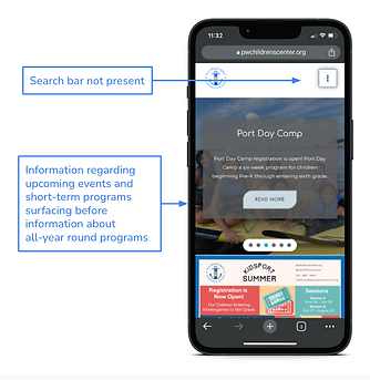
Figure 4: Problems illustrated on homepage
Solution:
Adopting a global search feature & supporting text for button list
-
To facilitate better navigation within the website, we suggest keeping a search button to allow users to easily find content using keywords.
-
Additionally, the buttons on the home page could be accompanied by supporting text and videos to help the users grasp the information much faster and clearer.
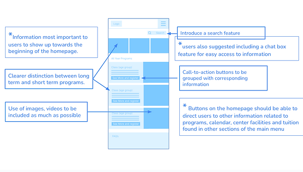
Figure 5: Suggestions illustrated for the homepage
Problem #2:
Payment portals are confusing, not sure where the money is going.
-
Many of the participants were not clear on whether they were making a tuition payment or if they are making a donation as both pages looked the same.
-
Another issue was that the redirection to another website was sudden and unexpected. As a result, their initial reaction was not positive and questioned the legitimacy of the payment portal.
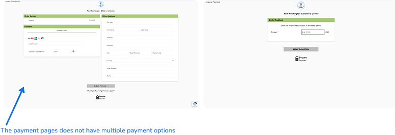
Figure 6: Problems illustrated on donations page
Solution :
Separate Tuition and Donation payment portals
-
One of the solutions for making the donation process better would be to have separate pages for the Tuition payments and Donation payments so that the users are informed about where the money is going, providing the needed clarity.

Figure 7: Suggested new pages for tuition and donation

-
Another suggestion is to have a small pop-up that would inform the user about the third-party payment portal that will open up, helping them prepare for the page change, and give reassurance in the legitimacy of the portal.
Note: To ensure that the tone of the text does not sound like a warning but reassuring, as that could be counter-productive and cause more doubt in the user.
Figure 8: Suggested new pages for tuition and donation
Problem #3 :
Participants unable to enroll from the program page
-
We found that the users got lost within the Program section, and would hover around. Upon questioning, they explained that they were expecting to be taken to the enrollment-related page from the program section they were interested in.

Figure 9: Problems illustrated on Learning page
Solution:
Include CTAs to directly allow popular tasks
-
Solving the problem of navigating to the enrollment-related documents could be done by having a clear Call-To-Action button where the users are able to enroll in the specific programs, as opposed to a generic enrollment form.

Figure 10: Suggested changes for Learning page
CONCLUSION
Our moderated testing over the course of this semester was deeply beneficial to gaining an understanding of the Port Washington Center’s user base, their thoughts and opinions, and their needs regarding regular use of the center’s website.
We as researchers acquired a substantial amount of information around the center’s mobile and desktop web design, usability, and payment processes, all of which was used to recommend certain specific feature and design changes to improve overall client experience and usage.
After our analysis and recommendations regarding potential shifts, we took the time to speak again with the center and give a presentation to both them and our teammates in order to showcase our results. We truly enjoyed working with the center, and would be happy to help them in the future with any additional analysis!
If you are interested in learning more about the project, explore it here!